


Of all the colours in the rainbow, blue is the hue that continually captivates us. From the palest of pastels akin to the sunny dawn sky, to the inkiest shades that backdrop the starry, dark abyss, blue is earthly, and our connection to it visceral: it’s the one tone we can use to tell the time. The hue of an afternoon blue is distinct from the twinkly turquoise of dusk, which is different again to the powdery, warm tone of a sky at dawn.
Blue is everywhere. From the ocean to the atmosphere up above, it envelopes us, and grounds us, every day. Deep within each shade, there’s a vastness that connects us to the universe and all the wonders it holds. So, it’s perhaps no surprise that it’s the world’s favorite colour. And there’s a tone for every mood — psychologists tout it as a colour to represent everything from sadness to serenity.
.jpg)
Artists have long been drawn to it. Ultramarine, a shade used by Vermeer, was once the most expensive pigment in the world. Derived from the stone lapis lazuli, mined from what is now Afghanistan, its name, ultramarine, means beyond the seas — an otherworldly shade. He might have named his most famous artwork Girl with the Pearl Earring, but her headband is the real standout accessory. Vermeer had such a penchant for it, he got his family into debt for it; it’s reported Michelangelo left one painting unfinished as he couldn’t afford to buy the ultramarine paint he wanted.
.png)
Such was the demand for this true blue that in 1824, the French government offered a 6,000-franc reward to anyone who could come up with a synthetic version of ultramarine. Prussian and Yves Klein blue followed in art. While in clothing, indigo was the hue of choice in the 18th and 19th centuries. This deep and rich blue, derived from plants grown in India and California, was used to dye textiles, including knitwear and jeans. A synthetic version was developed in the 19th century, but as sustainability has become a bigger part of the fashion discussion, natural indigo is experiencing a return.
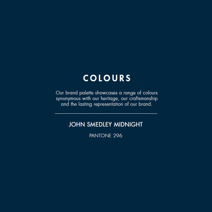
Yves Klein proved that colour could become a personal brand. And today, colour is a way for brands of all kinds to communicate identity. Becoming synonymous with a shade is a way to cut through the noise in this online era — and a way to connect with customers constantly, to remind them of the company’s existence. Most British people will think of Cadbury when they see purple. John Smedley’s distinct colour is blue.
.png)
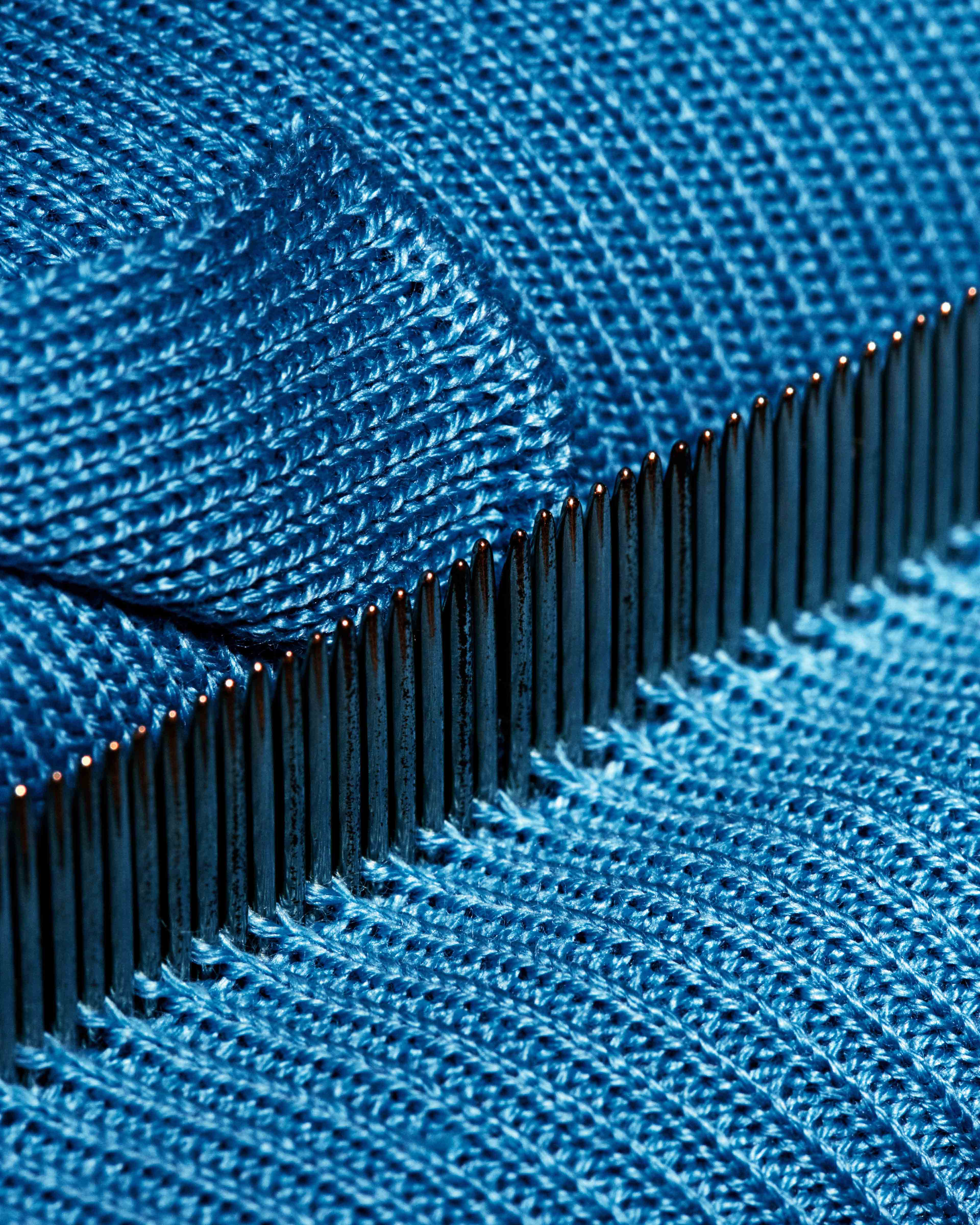
The hue has been a part of John Smedley’s brand identity since the 1700’s after John Smedley himself was inspired by the blue tipped wings of the local Jaybirds, still seen at Lea Mills today. But it’s no ordinary blue. It uses a custom shade of midnight, named Pantone 296. It’s an inky and elegant shade with a warm undertone. It’s timeless, communicating a sense of legacy that reflects the history of the brand, while also being relevant in the here and now — and in the future. In this digital era, blue stands out more on a screen than black — that’s why animators often use brighter and bolder shades, like turquoise and cobalt. Blue is adaptable for the contemporary age.
.png)
.png)
.png)
John Smedley's signature Pantone 296 hue was introduced in 1999. It "reflects the darkness and clarity of the skies in the remote valley of Derbyshire, where our mill is located", says Ian Maclean, MBE, the brand's managing director and eighth-generation Smedley family member, who developed the shade with Pantone's team of colour specialists.
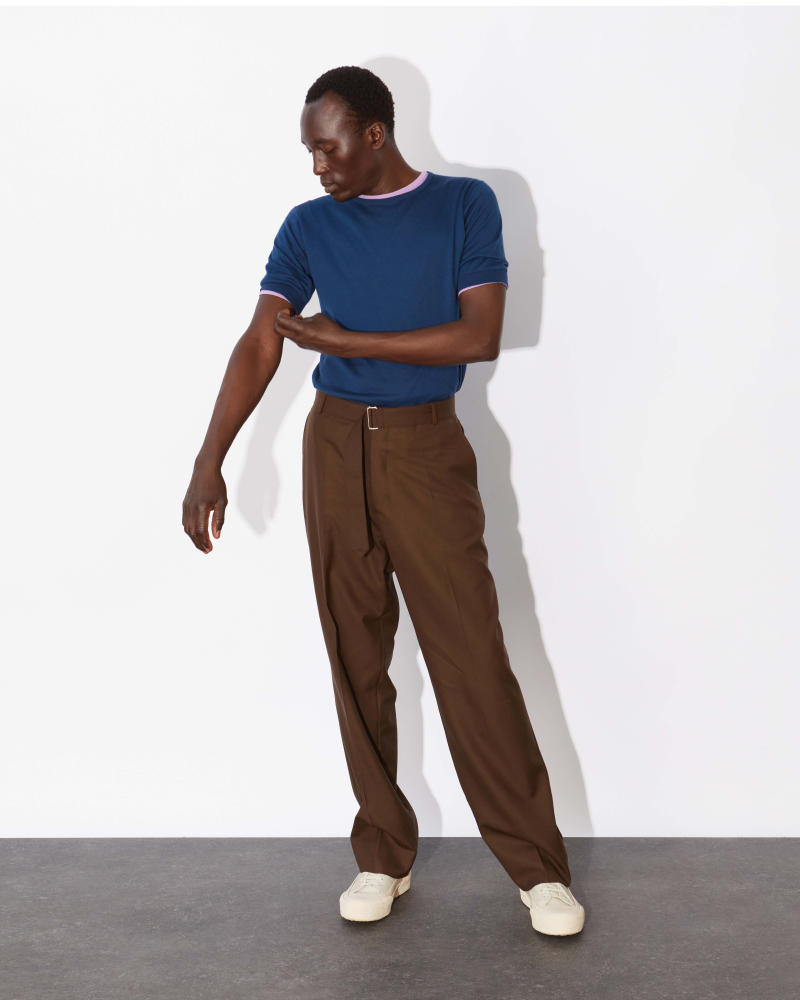
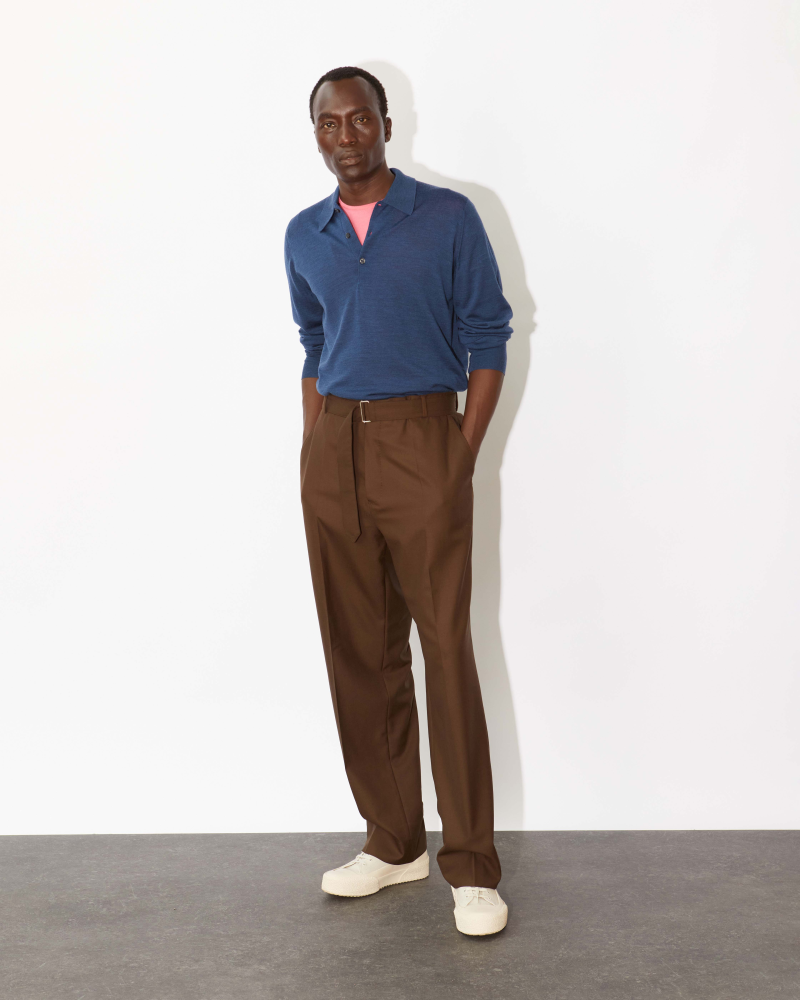
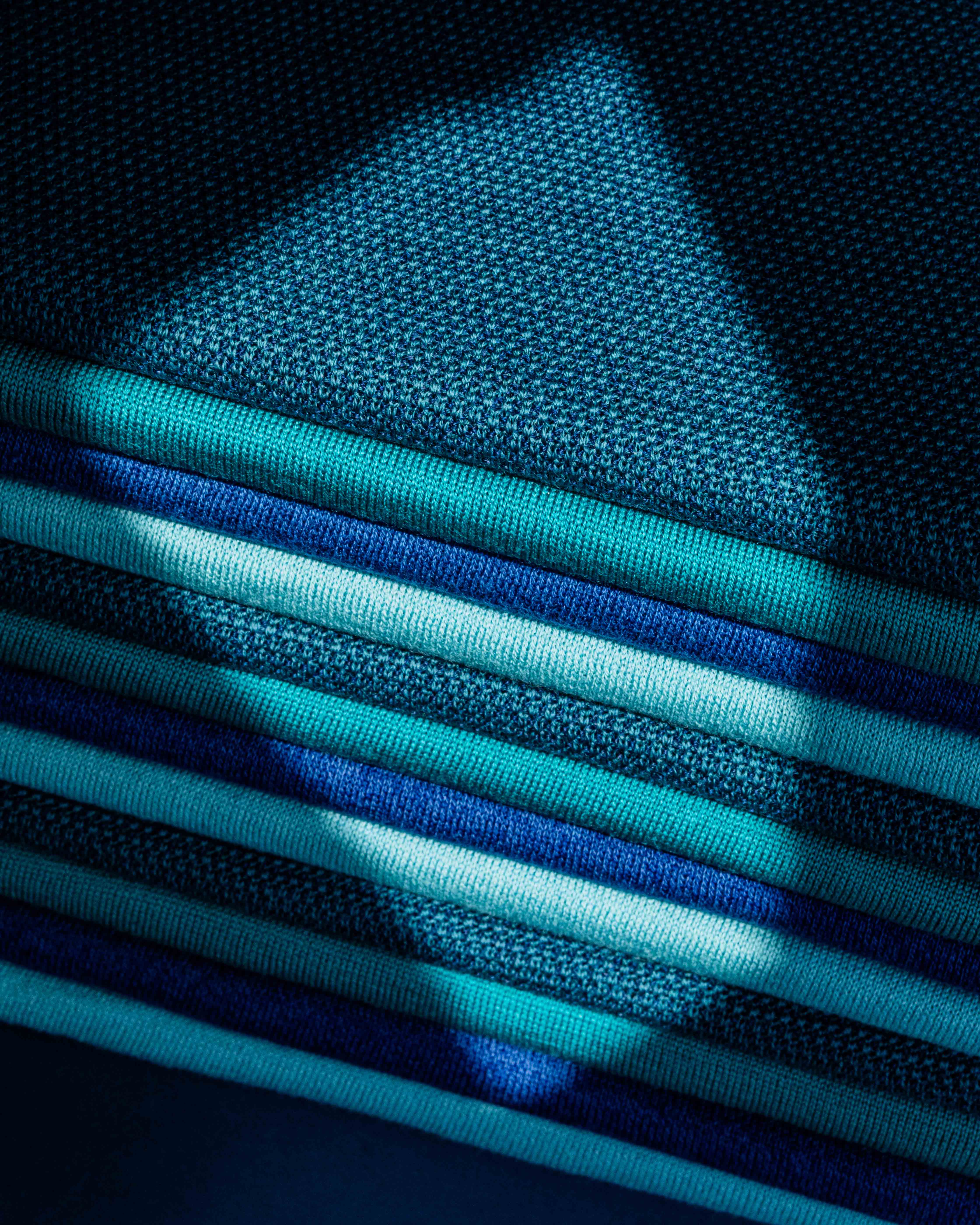
A spectrum of blues informs the John Smedley palette, imbuing everything from the core and seasonal collections to the packaging and retail stores. Look inside, and shoppers will see piles of merino wool sweaters stacked within cubby hole shelves lined in navy. The sweaters themselves — crew neck, short-sleeved or V neck — speak to this painterly blue palette. Shades of pale blue, petrol and navy are a constant in the collections.
Blue’s enduring quality across the centuries, and across artistic mediums, from clothes to cartoons and canvases, shows that this true hue is never out of style.
 |
 |