Have you ever given black or white much thought? These monotone shades are so everyday, and to an extent so austere, that it’s unlikely they conjure an emotion in the same way that colours can. Yellow is a mood-booster. Blue supposedly telegraphs calm; green, vitality. But the expansiveness of black and white and their very absence of colour has rendered them deficient: black is adopted in grief for this reason. It’s become an expressive code for a lack, and of loss. In the mind’s eye, black can evoke an emptiness that’s not attributed to those found on the colour wheel. In turn, they trigger our imagination a little less.
Mono as a word means one: singular. The same. Even the word to describe it reinforces there’s no need for expression or expansiveness.
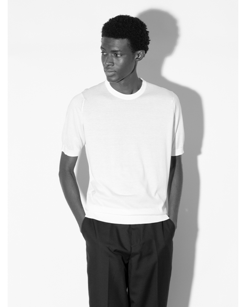
But there is poetry to be found in black and white — and the middling grey area. Long before technology turned the world technicolour, life was seen through monochrome’s shadowy prism. Artworks were rendered in charcoal; photography and film in black and white. These supposedly empty shades are timeless, and, in fashion, forever tasteful. Colours come and go, driven by trend-led seasonality that entice the eye and capture our attention. But when has a white shirt, or a pair of black tailored trousers or a grey turtleneck ever been out of style? Audrey Hepburn, who loved a John Smedley Catkin sweater, is cited as one of the most enduringly fashionable women for a reason.
In clothing, black didn’t really exist until the 14th century. Prior to this, textiles were dyed with natural elements like tree bark that lent them an earthy palette; no garment was as dark or deep as the pitch black midnight sky. Later, the development of synthetic dyes resulted in true black textiles as we know them today: it was predominantly worn by manual workers and those in mourning. In contrast, white has historically been adopted as a symbol of purity — worn by the suffragettes, brides and babies. Now, in this age of climate consciousness, white has once again found itself realigned with this meaning. Undyed textiles like cotton, linen and wool, in their raw state, are off-white — just like John Smedley’s British wool collection. Dye-free garments have come to signify more responsible practice.

So what then, for grey? This middle shade that is neither black nor white, but which has, in recent years, come to telegraph everything from Scandinavian calm in interiors to the glum British weather? Despite its diversity, there’s a seriousness to grey that harks back to school days: it invokes ideas of September uniforms, of study days and stricter schedules. This association is a psychological knock-on effect from the fact it’s also the shade of industry: charcoal powered everything from the railways to the mills in the north of England during its manufacturing heyday, where John Smedley proudly resides. Look at any LS Lowry painting, and you’ll see clouds of productive smog billowing from the chimneys.
As with any hue, there’s a spectrum of grey: it takes time and attention to perfect each tone. Paler shades, like John Smedley’s feather grey, is inspired by the soft tones found on birds and brings with it a lightness that reflects the fluff of each feather. Flannel grey, a middling tone, was inspired by tailoring and the textures and hues found in overcoat cloth, while the charcoal is more industrial.

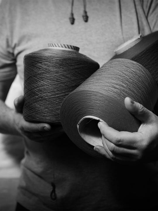
To create its signature charcoal, John Smedley pioneered a shade that mixed five strands of black yarn with four ecru and one navy; these were mixed using a craft technique where the yarns were pulled repeatedly by hand until they turned grey. So dedicated to his pursuit of the perfect grey was Mr Smedley, that he would take notes regarding the percentages of each batch, to ensure he could replicate the final tone exactly. Grey inspires a studious approach in even the most creative mediums, it seems.