What comes to mind when you think of Britain?
An American might answer this question with reference to accents, bad weather, and biscuits. Others might refer to our breakfasts, or pots of tea in china cups. Design types could refer to London’s architecture — a vastly diverse and beautiful city that caters to all types, from gothic (Westminster Abbey and Parliament) to baroque (St Paul’s Cathedral) to post-war modernism (The Barbican).
Dig deep enough, and the chances are the references will become more visually abstract, referencing not a place or a person, but a particular colour that goes beyond those found on the national flag.




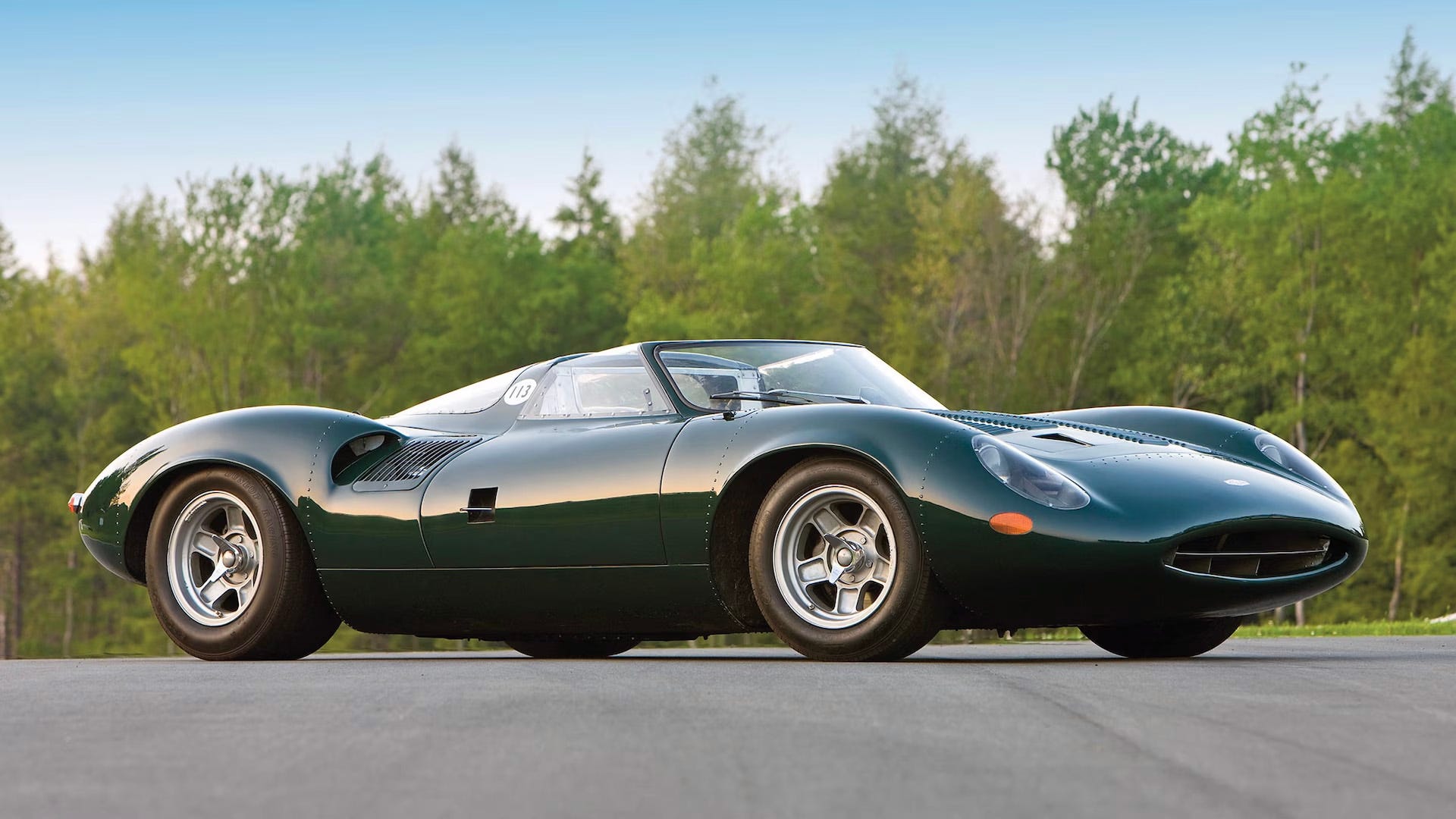
Take British racing green. This rich, warm, deep green hue is such a specific tone that now feels so British in its identity, it’s become a part of our heritage, as if conjured from the pages of history books. It’s surprising when you consider the fact that green has its roots in many other countries and cultures, from Ireland, the land of the shamrock, to Jamaica, which has a similar verdant shade in its flag.
Colour is contextual. And tone matters. British racing green is lent its distinctiveness through its black undertone: paint companies today mix an array of green shades with black to land on the hue. The shade actually has its roots in motorsport in 1902: Britain needed to paint its cars a different colour than those found on its Union Jack, as those shades had already been claimed by the USA and France. In homage to Ireland, the host nation, the UK decided upon green. And its association with our teams on our screens has turned this shade into something of a national treasure — it’s now found in house paint colours, in tartan linings of waterproof jackets, and in pubs. In clothing, today it feels as much a part of our legacy as the cobbled streets of Savile Row.

Another shade synonymous with Britain is Air Force Blue — that specific grey-blue shade of RAF military uniform, which is today found across fashion and homewares as well as worn by other units within the Commonwealth, in New Zealand, Australia, and Canada. Situated in the middle of the azure blue tones, there’s a cool, calming formality to this shade that feels very appropriate for a nation who reportedly have a stiff upper lip. Compared to other famous blues, like Yves Klein, Air Force Blue is subtle and timeless. No surprise, given this shade, which riffs on a clear blue British sky, has been the colour of our airborne military for a century.
Other very British colours include a spectrum of greys: they’re reminiscent of the weather and our industrial heritage in steelworks, the railways, and mining. No surprise painter LS Lowry used grey in abundance when depicting scenes of northern English factories, in the mid-20th century. See also deep purple, that Quality Street hue which denotes all things Dairy Milk and Cadbury, as well as being the official colour of royalty, seen in abundance in sartorial royal archives at the Tower of London and during any official royal outing. Black also feels very British: think Winston Churchill’s suits, the distinctively round cabs, Sherlock Holmes’ hats, and the refined typeface of our street signs.
Not forgetting, of course, red, white, and blue — a colour combination not unique to the United Kingdom, but which feels British in the way that it is used beyond the flag. In the 60s, it was a palette adopted by Mods with a tricolour bullseye symbol: the rings of red, white, and blue were originally found on Air Force planes and were later adopted by band The Who. The London Underground symbol — a clean, modern, and almost space age-symbol called the roundel, is also a now-iconic take. Red, as a standalone shade, is equally British: think Royal Mail’s logo, London’s buses, and telephone boxes.





Colour is deeply associative. And certain shades form part of the fabric of our national identity in a way that is readable visually — no dictionary or online translation tool needed. When used across different contexts, from clothing to interiors, colour has the ability to subtly reference our own cultural history in a way that it becomes part of our lens, and the way we recognise and interact with our environment. This familiarity is built up over years through so many touchpoints that it becomes part of our lens to the extent we may not even remember, or ever have known, its origins. Colour is an omnipresent facet of our daily experience.
Shakespeare famously wrote that a rose by any other name would smell as sweet. Similarly, that distinctive racing green, in any medium, anywhere, will remain inherently British — even if it’s given another moniker.


