Life is not lived in monochrome. And from the moment we wake each morning, colour saturates our very existence. From the dawn light to the blue of the sky or the grey concrete underfoot, to the foods we eat, the hues we paint our homes, and the clothes we choose to wear. This rainbow of visual stimulation, from bright and bold to dark or muted, is everywhere.
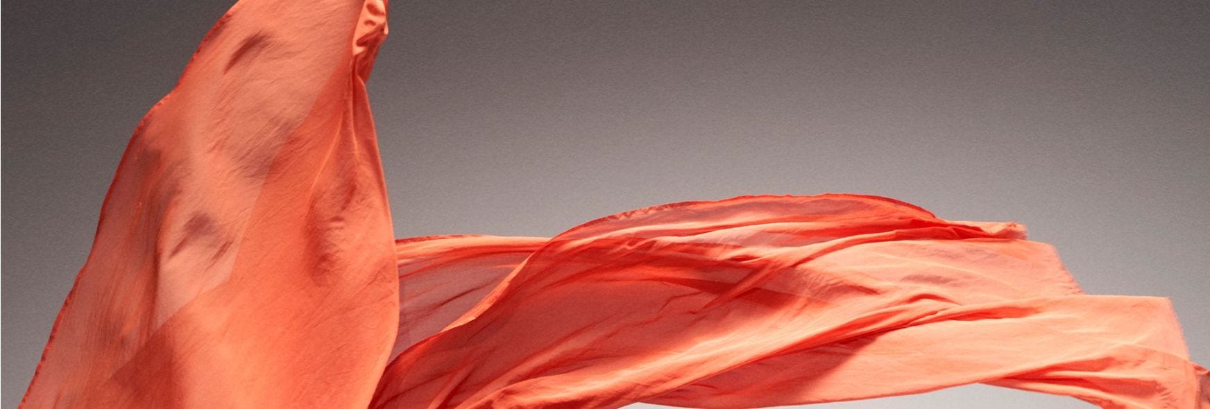
So fundamental is colour to the human existence, that it’s become a universal language. On the roads, red means stop no matter where you are. In storybooks, it signifies danger — a warning to pause, just like a Stop sign. In literature, like Margaret Atwood’s The Handmaid’s Tale, red signifies both fertility and oppression, and the world the handmaids occupy within this strict dystopian society is indeed dangerous.
In colour-coding her characters’ robes depending on their role in society, Atwood was playing on the historical tradition that clothes, and shades, are a communicator — a visual signifier of people and place. Colour can convey, above all, context, from the purple robes of royalty (later adopted by Cadbury, which was granted a Royal Warrant in 1854) to the term “blue collar labour”, which riffs on the manual work and overalls worn by workers’ in countless factories in the north.
Colour is not just a telegraph, though. Today, they’re also a vehicle for feeling — over the years, we develop our own attachments to certain shades based on life’s experiences, memories and personal connections. Perhaps it’s a penchant for yellow roses that grew in a grandmother’s garden; maybe it’s a shade of cornflower blue that a parent wore and loved. Just like scent, which can evoke a different time and place, colour has the ability to transport our imaginations.
That’s why it also has the power to transform. Today, the psychology of colour is much reported on: colour is scientifically proven to contribute to the way we feel. The Swiss psychologist Carl Jung, who discovered the connection in the early 20th century, is reported to have described colour as “the mother tongue of the subconscious”. In his work, he explored the effect of art therapy, where paintings, expressions and imagery can help unlock a patient’s trauma.
It wasn’t an entirely new concept. It drew on practices used by the ancient Egyptians, where rooms painted in certain hues were a cure for particular ailments. It’s no surprise that, as paint colours on our walls have become a de facto meaning of self-expression, so too have the meanings (and associated shade colours) attached to them. A soft yellow hallway, named ‘Custard’ might inspire a jovial feeling of comfort; a tranquil shade of blue will inspire, in some, a calm mood.
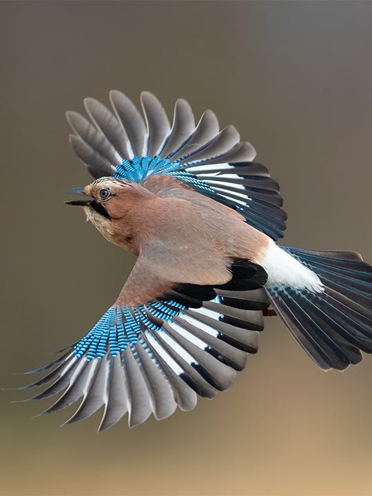
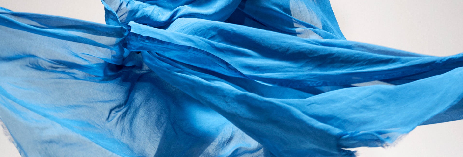
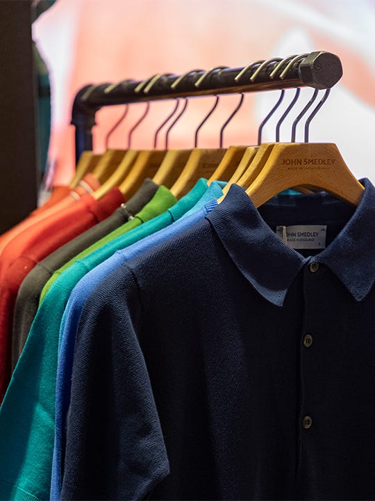
Clothing is no different. Contemplate your favourite sweater, and the chances are it instills in you a certain feeling — and the chances are, it’s blue. Universally, blue is voted the world’s favourite hue, from the depth of inky navy, which is a warmer alternative to black, to pale sky blues that are perfectly worn on spring days to better reflect the lighter and brighter weather. John Smedley has used blue in its branding since 1784 after their founder John Smedley was inspired by the bright blue tipped wings of the local Jaybird, while the artist Yves Klein loved blue so much, a shade is even named after him. No matter the mood, there’s a shade of watery blue to plunge yourself into.